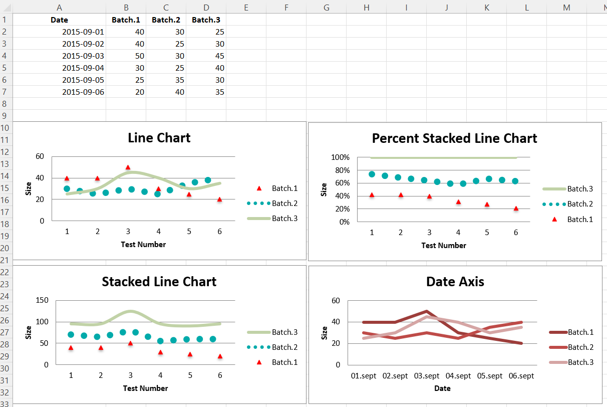
Line Charts
Three kinds of line charts
Line charts allow data to be plotted against a fixed axis. They are similar to scatter charts, the main difference is that with line charts each data series is plotted against the same values. Different kinds of axes can be used for the secondary axes.
Similar to bar charts there are three kinds of line charts: standard, stacked and percentStacked.
library(xlcharts)

line <- data.frame(
  "Date" = as.Date(c("2015-09-01", "2015-09-02", "2015-09-03",
                     "2015-09-04", "2015-09-05", "2015-09-06")),
  "Batch 1" = c(40, 40, 50, 30, 25, 20),
  "Batch 2" = c(30, 25, 30, 25, 35, 40),
  "Batch 3" = c(25, 30, 45, 40, 30, 35)
)

write_xlsx(line, "line.xlsx")

wb <- load_workbook(filename = "line.xlsx")

ws <- wb |> active()

c1 <- LineChart(
  title = "Line Chart",
  style = 13
) |>
  y_axis(title = 'Size') |>
  x_axis(title = 'Test Number')

data <- Reference(ws, min_col=2, min_row=1, max_col=4, max_row=7)

c1 |> add_data(data, titles_from_data = TRUE)

# Serie 1
s1 <- c1$series[[1]]

# marker
s1$marker <- Marker(symbol = "triangle")

# marker.graphicalProprieties
s1$marker$graphicalProperties <- GraphicalProperties(
  solidFill = "FF0000",
  line = LineProperties(solidFill = "FF0000")
  )

# graphicalProprieties.line
s1$graphicalProperties <- GraphicalProperties(
  line = LineProperties(noFill = TRUE)
)

# Serie 2
s2 <- c1$series[[2]]

# graphicalProprieties.line
s2$graphicalProperties <- GraphicalProperties(
  line = LineProperties(
    solidFill = "00AAAA",
    dashStyle = "sysDot",
    width = 100050
    )
  )

s3 <- c1$series[[3]]
s3[["smooth"]] <- TRUE # Make the line smooth

ws |> add_chart(c1, anchor = "A10")

# Stacked Line Chart
stacked <- deepcopy(c1)
stacked$grouping <- "stacked"
stacked$title <- "Stacked Line Chart"

ws |> add_chart(stacked, anchor = "A27")

# Percent Stacked Line Chart
percent_stacked <- deepcopy(c1)
percent_stacked$grouping <- "percentStacked"
percent_stacked$title <- "Percent Stacked Line Chart"

ws |> add_chart(percent_stacked, anchor = "A44")

# Chart with date axis
c2 <- LineChart(
  title = "Date Axis",
  style = 12
) |>
  y_axis(
    title = "Size"#,
    #crossAx = 500
  ) |>
  x_axis(
    number_format = 'd-mmm',
    majorTimeUnit = "days",
    title = "Date"
  )

dates <- Reference(ws, min_col=1, min_row=2, max_row=7)

c2 |>
  add_data(data, titles_from_data = TRUE) |>
  set_categories(dates)

ws |> add_chart(c2, "A61")

wb |> save_workbook("line.xlsx")
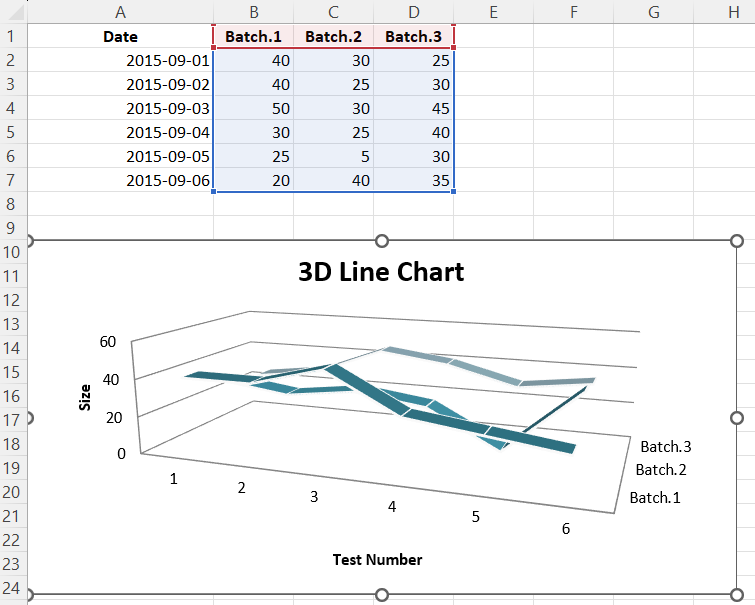
3D Line Charts
In 3D line charts the third axis is the same as the legend for the series.
Warning
3D charts are almost always inappropriately used, as interpretation is improved by turning them into regular 2D figures. Please avoid making 3D charts.
wb <- load_workbook(filename = "line.xlsx")
ws <- wb |> active()

c1 <- LineChart3D(
  title = "3D Line Chart",
  legend = NULL,
  style = 15
) |>
  y_axis(title = 'Size') |>
  x_axis(title = 'Test Number')

data <- Reference(ws, min_col=2, min_row=1, max_col=4, max_row=7)

c1 |> add_data(data, titles_from_data = TRUE)

ws |> add_chart(c1, "A10")

wb |> save_workbook("line3D.xlsx")
This page is an R replica of the related OpenPyXL documentation page.